The website was created by implementing the design mockup from Figma using pure HTML, CSS, and JavaScript. The primary focus was on developing a responsive and adaptive design that ensures optimal user experience across various devices and screen sizes. This means that the layout and content of the website dynamically adjust to fit desktop computers, laptops, tablets, and mobile phones.
To streamline the development process and improve efficiency, a template built with Gulp and Webpack was utilized. This template provided a foundation for automated tasks, such as compiling SCSS to CSS, optimizing and minifying files, and bundling JavaScript modules. Gulp and Webpack enabled a more organized and efficient workflow, enhancing the development process.
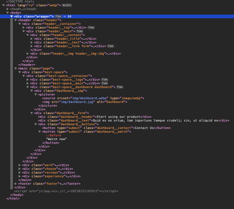
Several methodologies and technologies were employed during the development process to ensure code organization and maintainability. The Block-Element-Modifier (BEM) methodology was used for naming and structuring CSS classes, promoting a modular and reusable approach to coding. This methodology enhances code maintainability and scalability.
The SCSS preprocessor was utilized to enhance the styling process. SCSS provides features like variables, nesting, and mixins, which simplify the development of complex stylesheets. It allows for code reuse, improves readability, and makes styling more efficient. SCSS compiles into regular CSS that is supported by web browsers.
To create flexible and responsive layouts, the Flexbox layout model was implemented. Flexbox is a CSS feature that enables easy alignment and distribution of elements within a container. It provides powerful tools for building responsive designs and handling complex layout scenarios.
Throughout the development process, rigorous testing and debugging were conducted to ensure the website’s functionality and compatibility across different browsers and devices. Best practices for SEO (Search Engine Optimization) and accessibility were followed, including the use of appropriate meta tags, semantic HTML structure, and optimized images.
In summary, the website was meticulously crafted using HTML, CSS, and JavaScript, with the design from Figma serving as a guide. The development process involved creating a responsive and adaptive design to cater to various devices. Gulp and Webpack were utilized to streamline the development workflow, while methodologies like BEM and technologies like SCSS and Flexbox ensured code organization and maintainability. Thorough testing, adherence to best practices, and attention to detail ensured the functionality, compatibility, and optimization of the website.